Tips for Creating Effective Call-to-Action Buttons

In our post 6 Tips for Creating High Converting Landing Pages [in 2023] we discussed CTA’s or call-to-action buttons but didn’t go into too much detail. That’s exactly what we’re going to do in this article.

Call-to-action (CTA) buttons are an essential element of any website or marketing campaign. They’re the prompts that encourage visitors to take a specific action, such as signing up for a newsletter, downloading a whitepaper, or making a purchase. When used effectively, CTAs can help drive conversions and generate leads for your business. But with so many buttons out there, how do you create one that stands out and gets results?


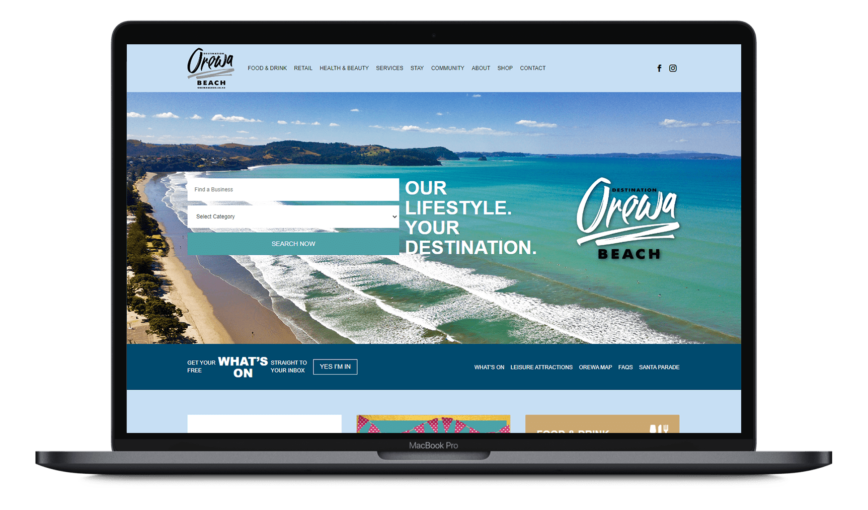
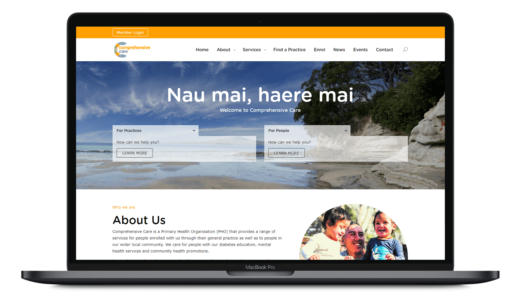
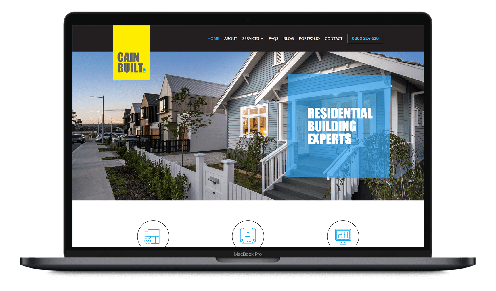
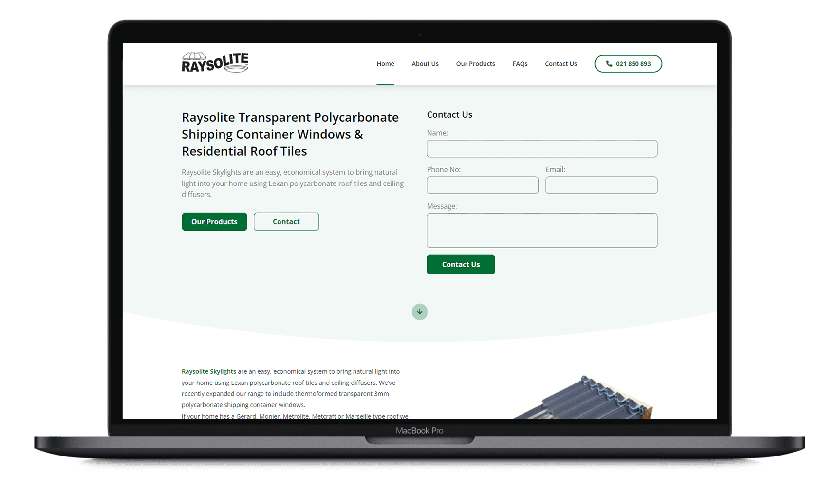
1. Make it clear and specific

The first and most important tip for creating an effective CTA is to make it clear and specific. Your button should clearly communicate what action you want the visitor to take, and it should be phrased in a way that’s actionable and easy to understand. Avoid vague or generic phrases like “click here” or “learn more.” Instead, use language that’s more descriptive and tailored to your specific offering.

2. Use strong, action-oriented language

In addition to being clear and specific, your CTA should also use strong, action-oriented language. Words like “download,” “register,” “sign up,” “get,” or “start” are all great options because they encourage the visitor to take immediate action.

3. Make it visually appealing

While the wording of your CTA is important, the appearance of your button is just as crucial. A visually appealing button will stand out on the page and grab the visitor’s attention. Use colours that contrast with the rest of your website or landing page, and consider using hover effects or animations to add some extra flair.

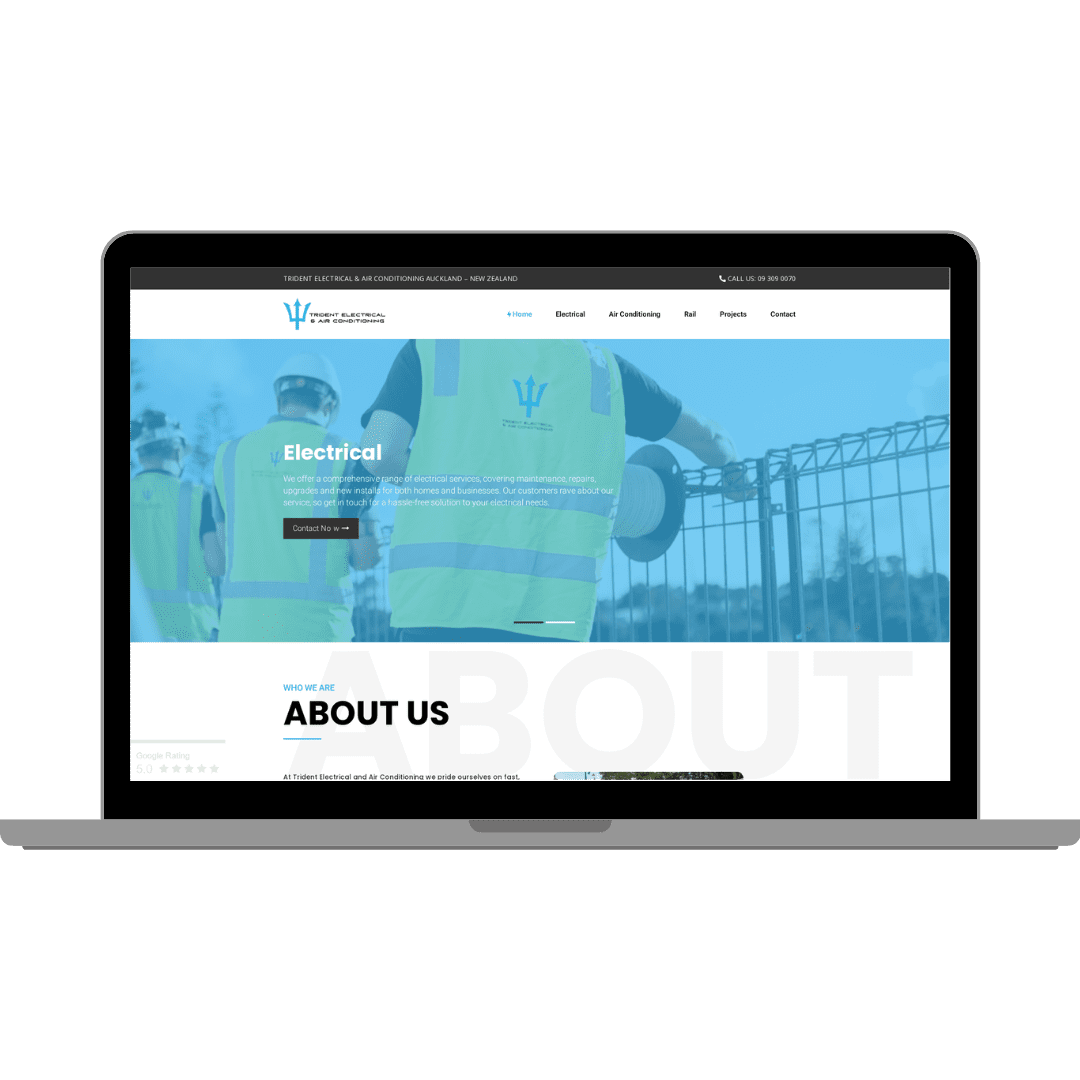
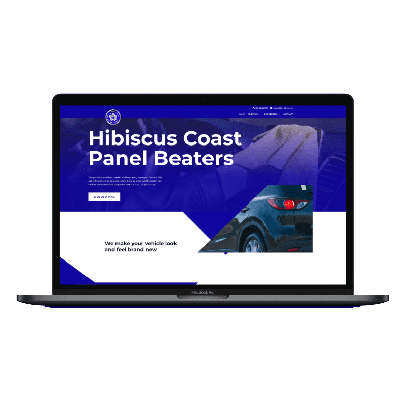
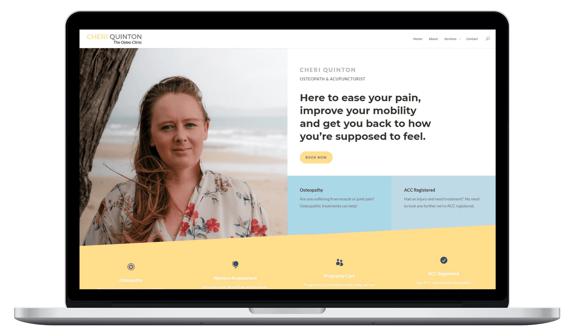
4. Place it prominently on the page

The placement of your CTA is also crucial. You want it to be easy for visitors to find and click on, so consider placing it above the fold (the top portion of the page that’s visible without scrolling). You can also use white space, formatting, and other design elements to draw the visitor’s eye to the button.

5. Test different versions and compare results

One of the best ways to optimise your CTAs is to test different versions and compare the results. This could mean testing different colour combinations, button sizes, or language options. Use tools like Google Analytics or A/B testing software to track clicks and conversions, and use this data to determine which version performs the best.

About the Author

Founder

I’ve always believed that each business is unique. Bringing this view to Mars Digital means we take the time to understand you and your business before going away, doing the research and coming back to you with our thought out recommendations and the reasoning behind them.

For me, it’s all about building a mutually beneficial partnership.

Our Work

Destination Orewa Beach

Destination Orewa Beach

Comprehensive Care
Comprehensive Care

Comprehensive Care

Coast Residential
Coast Residential

Coast Residential

Cain Built
Cain Built

Cain Built

Daylite Skylights
Daylite Skylights

Daylite Skylights

3D Online
3D Online

3D Online

JC Project Consulting

JC Project Consulting

Taxi Tax
Taxi Tax

Taxi Tax

Trident Electrical & Air Conditioning

Trident Electrical & Air Conditioning

Zakmir
Zakmir

Zakmir

Hibiscus Coast Panel Beaters

Hibiscus Coast Panel Beaters

Stella Beauty
Stella Beauty

Stella Beauty

Osteo Clinic
Osteo Clinic

Osteo Clinic

6. Use social proof or scarcity tactics

Including social proof or scarcity tactics in your CTA can also be an effective way to drive conversions. If you opt to use scarcity, be careful, this can sometimes come across as scammy. Social proof refers to the idea that people are more likely to take action when they see others doing the same. For example, you could include a statement like “Join over 10,000 satisfied customers” or “Limited time offer – act now!” to create a sense of urgency and encourage visitors to click.

7. Offer a clear value proposition

Finally, make sure your CTA includes a clear value proposition – in other words, explain to the visitor what’s in it for them. Why should they take the time to click your button and complete the desired action? Will they receive something in return, such as a free trial, a discount, or valuable information? Make sure the value proposition is clear and compelling to increase the chances of conversion.

Examples of effective call-to-action buttons

To give you some inspiration and ideas, here are a few examples of effective call-to-action buttons:

1. “Start free or get a demo”

This CTA, used by the software company HubSpot, clearly communicates the action the visitor should take and offers a clear value proposition – a free trial. The button is visually appealing, with a contrasting colour and hover effect, and it’s prominently placed above the fold.

2. “Join the movement”

This CTA, used by the non-profit organisation Charity: Water, uses strong, action-oriented language and incorporates social proof by referencing the movement of supporters. The button is also visually appealing, with a bright colour and hover effect.

3. “Sign up for updates”

This CTA, used by the online retailer Zara, is clear and specific, using language that’s easy to understand and actionable. The button is visually appealing, with a contrasting colour and hover effect, and it’s prominently placed above the fold.


Conclusion

By following these tips and using strong, action-oriented language, a visually appealing design, and a clear value proposition, you can create an effective call-to-action button that drives conversions and generates leads for your business. Remember to test different versions and track your results to continually optimise and improve your CTAs.


Marketing out of this world